#somereallygoodones, #andyfreeberg, #fairfare, #artfare
Andy Freeberg fares artfully.
With that out of the way, I can report that Andy Freeberg’s “Art Fare” photographs are shrewdly smart. They are colorful, well seen and well made. It is funny how true they are and how truly funny.
Full disclosure, I am in one of them. I have some discomfort with that as the writer here, and as an insider and outsider — looking at the photographs - I feel like a co-conspirator because — shhhhh!!! — the work is subversive.
Mr. Freeberg captures the madness of the art world, particularly as witnessed at all of those art fairs. There seems to be an ever increasing number of these monsters. You look for a coffee on the way to a fair, and it slowly dawns on you that there as many art fairs as there are Starbucks.
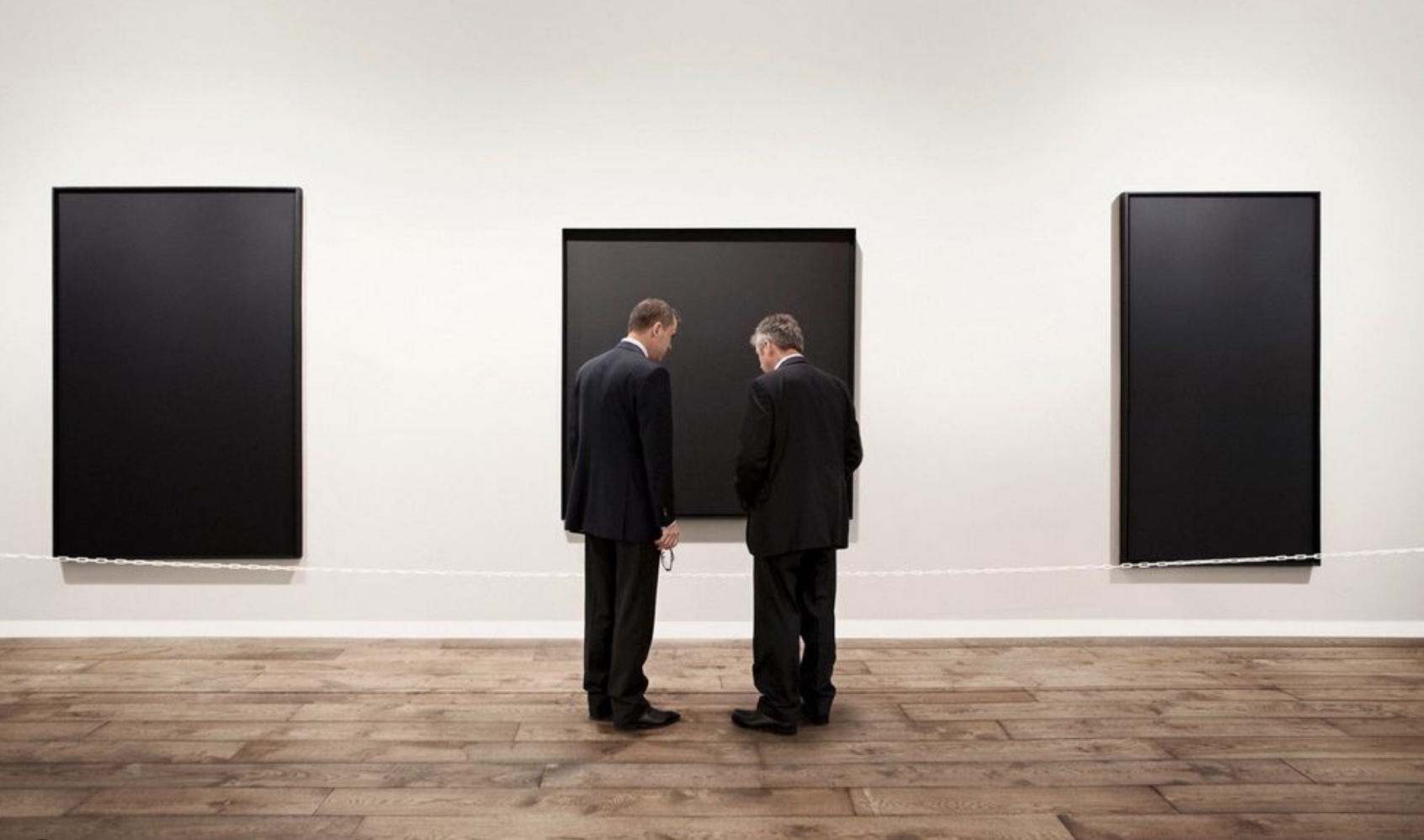
Andy Freeberg, “Marlborough Art Basel,” 2010
Two men in front of black paintings, let’s call them Gogo and Didi, are the central players in Mr. Freeberg’s “Marlborough Art Basel 2010," one of the best of these. It has existential gravitas and irony. Dealers, obviously, in dark suits are in very deep conversation in front of a triad (!) of equally black and serious paintings (Ad Reinhardt).
Mordant.
The abstract is expressed here.
It is an exquisitely crafted short play. The rectangle behaves exactly like a proscenium ensnaring the drama with the deal so weighty, so solemn, so black. Art is such serious fare. It is performance.
And we are more than audience or witness to the scene; we are a collaborator. Freeberg gives us an active role, more than observer. The two men are miming their peculiar dumbshow, talking in hushed voices because they don’t want us to hear. Nonetheless, they seem fully conscious of our presence; this is public private and private public. I
In his “Charlotte Lund, Armory Show 2011” and “Ferrin, Art Miami 2010” or “Contessa Gallery, Armory Show 2010”,the models in the paintings on the walls mirror the live dramas in front, with people messaging or standing, sitting, talking, staring off into space.
The faces in the paintings look down upon or simply look like the people in the booths, the gallery people. Chuck Close in his self-portrait resembles his texting dealer, and gallerist Sean Kelly appears to be mourning the luridly colored but prostrate model in his Kehinde Wiley painting.
As I said, this is sharp stuff.
Consider the exuberant and dynamic “Nina Menocal, Armory Show 2011” with the “real” people try to hold back Martin & Sicilia’s “painted” mob. This is epic, like Gericault’s “The Raft of Medusa”.
The unidentified Andrea Rosen gallerina could combust in her yellow T-Shirt fueled by the Wolfgang Tilman’s burst of color, and her counterpart at Matthew Marks works her hair like the tendrils of red in the painting behind.
“Spinello Gallery, Pulse New York 2010” really complicates this with the large work by the artist Zachari Logan. He is the naked boy whose presence repeats many times not only as the figure in the painting, interacting with himself, but also as the artist present at the art fair who, at first look appears to be talking to himself or his doppelgänger. He is all over the place, charging the situation exponentially.
On the other hand, work like “Rokeby, Art Basel 2010” can be still, even grim with only the sparest of sculptures by Bettina Buck, two black skulls seeming to look on as if watching a cadaver, all drifting in an oatmeal colored sea.
Mr. Freeberg is fair in these circumstances. He is non-judgmental — to a point. He is the distiller of these lunatic dramas, capturing moments, tight but telling vignettes. Art Fairs may seem like fun, but in my experience, they are desperate commerce — exhausting, expensive, superficial, shrill, verging on lunatic.
Here is a scenario for “Christopher Cutts, Scope Basel 2010”. Two men, again, all cleaned up, in their nice suits, with their close cropped hair, are our protagonists, Art Ninjas, both bull and matador. They are deeply into each other Maybe these men are talking about moving the Richard Stipl skyscape or the whatever, but, importantly, they look good.
The man on the left has a cafard above him, a cloud of anxiety. Or maybe it is the opposite, maybe it is Road to Damascus luminescence, insight or revelation — all clustering overhead. The light of the painting is working through the blues and pinks. Deliverance. Salvation. Hallelujah! It is difficult to read his state of mind so we can take it from the painting.
The connection between the men is measured and articulated precisely — the hands, the chins, and the abyss on the left balanced by the void, the cool still negative space on the right.
The photographs look good too.
The dealers and their minions are putting on a show; they’re in turmoil — sell or die. Their seeming coolness is a lie. Even Prozac can’t mask it (“Max Hetzler, Art Basel Miami Beach 2009”) or resist incoherent “BLAHBLAHBLAH” babbling (Mel Bochner, “Two Palms, Armory Show 2011). But they put up a barrier of invisibility disappearing into their I-devices or even going over the wall in “Margaret Thatcher Pulse Miami 2010 Omar Chacon.”
What is the deal with the phones and the I-Pads? Everyone is reading; they’re off in a separate dimension. You would think that more attention would be paid to what is actually going on in the room — possible sales. It’s all virtual, and not about connecting directly with the public.
“Art Fare” has clarity. The lighting is clean and crisp. We see everything. Whatever you may think of art fairs — and it would appear that I think they are life force draining, soul sucking events — the mood here is consistently sunny and upbeat. The artists says he “found the lighting, the costumes, and set design excellent for photographing these living dioramas, where the art world plays itself”*1. Indeed.
The colors are bracingly fresh. The works do not look like anyone else’s. Freeberg’s classic sensibilities have married exquisitely with contemporary technologies — the camera and the printing. Single planes of color cut through the white. Yellow envelops the figure in “Nicole Klagsbrun Armory Show 2010 Adam McEwen” or acts like a field of color in “Peter Blum Art Basel Miami Beach 2010 Alex Katz”. Blues and reds and greens pop with the white walls and even lighting.

Andy Freeberg, “Hasted Hunt Kraeutler Art Miami”, 2009
I know too much. I have been a dealer and such an insider that I am in these pictures. Literally. I am “Hunt” on the left in “Hasted Hunt Kraeutler Art Miami 2009”. The three of us all seem to be “on the phone”, in fact or in spirit. We are not in the arena. The electrical connectivity in the black and white Nathan Harger photographs behind us mock us and our separateness. We dream of commerce and of escape.
Yes, Virginia, there is a metaphor. Mr. Freeberg gets it. He sees it and lets us in on it.
One of my favorite relatively contemporary paintings is Mark Tansey’s “The Innocent Eye Test” 1981, which is not illustrated here unfortunately. This is a very large scale work, and it depicts a cow in an art gallery — undoubtedly a prize cow - looking up a painting of a pair of similarly prize cows, in seeming judgement. The scene includes a number of serious looking and onlooking gentlemen, one with a mop, anxiously anticipating the viewer cow's reaction. It is charmingly absurd. I have seen it hung low to the ground. That and the size bring you into the scene, lead like the innocent critic. Mr. Freeberg’s “Art Fare” works seem as large. You have a sense of enormous space and he brings you, slightly —er — cowed, into it. >
“Art Fare” is another chapter in a triptych, so far, about the art world today. There is an earlier body of work titled “Guardians," images of women attending paintings in Russian museums. These are droll and good looking, with luminous and ingeniously balanced color.
This was preceded by the series, “Sentry," picturing art gallery reception desks, with gallery girls and boys in black sitting distractedly behind them. Most often we only see the tops of heads, The images are consistently and immaculately white, drained of color, and by extension, life.
“Art Fare” is more active and fluid. With “Guardians” this may reflect a cultural divide between the two countries. “Sentry” may simply be very accomplished and early work. Freeberg has a consistent ease with color and light. “Art Fare” signals his increasing confidence, sharpness and speed.
He sees very quickly and pointedly (the sailfish in “Spencer Brownstone, Art Basel Miami Beach 2009”). He is able to line up faces looking down condemning (Dimitris Andreadis at “Ileana Tounta, Armory Show 2010”) or enigmatically as Gavin Turk’s look alike Andy Warhol slyly surveys the scene (“Krinzinger, Armory Show 2010”).
And we can end our tour with the legendary. Look at “Gagosian Gallery, Art Basel Miami Beach, 2009” with Chuck Close contemplating an Andy Warhol soup can, possibly Mr. Freeberg’s riff on Rembrandt van Rijn’s “Aristotle with the Bust of Homer.” Why not?
Freeberg finds that odd little drama; he is not damning, but instead, wryly amused and curious, intent on sharing the irony and the inanity.
Here the art fares more than fairly.
*1 Conversation with the artist, 2012
This essay is adapted from “Fair Fare” was commissioned for “Andy Freeberg, Art Fare”, (Sojourn Books, 2014) © 2012
©2021
#somereallygoodones, #theunseeneye, #wmhunt, #collectiondancingbear, #collectionblindpirate, #greatphotographs, #howilookatphotographs, #photographsfromtheunconsicous, #collectingislikerunningaroundinathunderstorm hopingyoullbehitbylightning, #aphotographsogooditmakesyoufartlightning, #photographychangedmylifeitgavemeone, #somereallygoodones, #andyfreeberg, #fairfare, #artfare